|
I'm Not a Fan of Programming Font Ligatures
Friday, May 10, 2019
==, ===, !=, !==, >=,
<=, =>, etc. into single symbols (this occurs as you type; you don't need to do anything special).
They look like this:
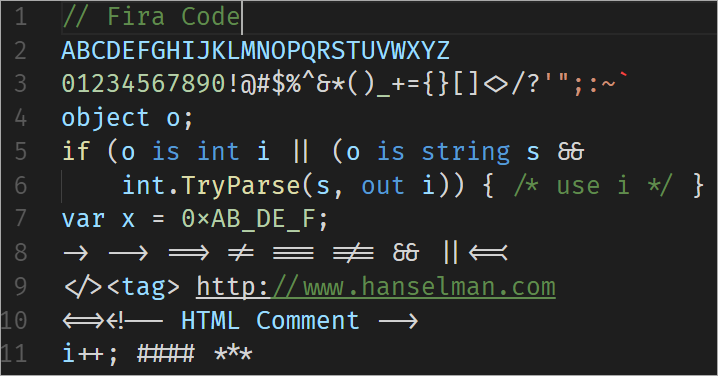
Image courtesy of Scott Hansleman (https://hanselman.com/blog/MonospacedProgrammingFontsWithLigatures.aspx) Now, you may look at that and think, "hey, those thing look pretty cool!" In my opinion, "looking cool" is about all those things have going for them. My two chief complaints about programming font ligatures are:
<==>, you know you typed two equal signs because you see two equal signs.
With ligatures, however, it can be difficult to know exactly what you're looking at.
In some cases, like combining >= into a single symbol, it's more obvious (but more on this later). When we start
combining == and ===, however, I actually find it takes more mental energy to read the code.
We lost that little bit of space between the individual equal signs, so now in addition to my
brain trying to decide how many characters wide that single "ligature equal" is, it has to count
the number of lines vertically within the ligature to determine if it's a double or triple equal.
I think my brain could (and should) be doing more valuable work.
For example, look at line #10 in the screenshot above. HTML comments start
and end with <!-- and --!>. At first glance, however, I couldn't tell if
the "HTML Comment" text had three dashes in the opening tag or two. My inclination was to
guess "two", as that's the convention. I had to look at line #9 to try to line
up the word "tag" with the dashes, and I don't really want to have to do that. In fact,
even after reading line #10 several times, it's still hard for me to tell at a glance if there are three dashes
on the left and two on the right, or two and two, or what (primarily because the <!
is mashed into what almost looks like one character width).
One of the key reasons many (most, I'd assume)
people use monospaced fonts for coding is that each character is on a fixed and easily identifiable
boundary. By removing the inherent visible spacing between characters, ligatures negate that benefit, and
I find myself constantly looking to the line above or below it for reference to measure how wide
in characters the ligature is. I don't want to have to do that. Ever.
I think the arrow at the end of line #8 is another perfect example.
I don't actually know what that symbol is nor how it was typed. Is that <=< ? Or <==< ?
Or...? Is it just a fancy arrow? Or did the font author get creative with something like a
bitwise shift operator <<= ?
This I think demonstrates both of my chief complaints pretty well. I can't tell which keystrokes
make that thing up, and without knowing the context it's used in, I'm kind of lost. By context, I
mean this: in the screenshot below, I can tell the language is C#, so it's more obvious to me
that the arrow ligature is => versus ==> or anything else. If I didn't know C#, however, this may
not have been as obvious. But what about that <==< arrow on line #8? Unless I know what language that's used
in and what it does, I don't even know for certain how to type it. At the end of the day, I shouldn't have to be familiar with the language
to know how to produce the ligature.
I also don't like the <= ligature shown below. Whereas at least the "does not equal"
ligature clearly spans the width of the letters "a" and "l" above it, the <= ligature
almost looks like it's sitting on a single character width. I'm assuming that, since it is
in fact two characters, the ligature is actually straddling both l's in "null" below it, and I
could see myself being driven nuts by this.
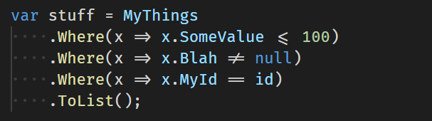
Image courtesy of Dan Clarke (https://www.danclarke.com/fira-code) I've actually read some pretty opposing opinions regarding ligatures, but two that stand out to me are:
/= or =/= in Erlang to make it or I'm just going to see /= and =/= and wonder if they actually mean "does not
equal", since they weren't turned into ligatures.
I'm guessing it's not the former; two different character sequences which produce the same
ligature seems like a recipe for madness. If it's the latter, that makes programming ligature fonts
at least somewhat language specific. If I can't rely on a "does not equal"
ligature appearing as I move from language to language, I don't find ligatures very useful.
And what about the <> form of "does not equal" some languages use? Does it get turned into a "does not equal" ligature?
Maybe, maybe not. In the case of Fira Code, it's turned into what looks like a diamond, which personally
conveys nothing to me.
It's up to the font designer to put the ligatures in place, so I suppose a given
font could turn <> into a "does not equal" ligature if designed that way. But if it doesn't, what's the point?
And if it does, what about the (future?) language where <> doesn't mean "does not equal" ? Something
about language-specific fonts just doesn't sit well with me. With great editors like VSCode
enabling us to move from language to language to language quickly within the same tool, a
language-specific font just seems wrong to me, even if the font does include ligatures which
span a number of different languages.
Concerning the second point above, I don't think ligatures are great for beginners for the exact reasons I
cited above. For someone new to programming in general, I think ligatures are a barrier to entry.
In many languages, <= obviously means "less than or equal to", and if this gets replaced with
a ligature, someone new to programming will understand what this means. But what happens
when next time, they try to type =< (versus <=) and don't get a ligature? Isn't "less than or equal to"
the same thing as "equal to or less than" ? I think it's important for a new programmer to understand that each
character typed and its order is significant, and ligatures mask this
by hiding the underlying characters' order in some cases.
I think even for an experienced developer working in a new language, ligatures can be confusing. If !== is turned into a ligature but /= or =/= are not, I would think
it would be reasonable to assume that /= (in particular) does not mean "does not equal"
in that language – even if it does.
For what it's worth, in Erlang, "less than or equal to" is represented by =< not <=. Whether this gets replaced
by a ligature or not, I don't know (again, I'm assuming not), but regardless, I think it poses a problem. If it doesn't,
then there's the matter of consistency: <= gets a ligature while =< does not. It it does,
there's the matter of context: if I simply see a "does not equals" ligature, I don't how to type
this without knowing the context/language around it. Is it !=? =/=?
We're back to trying to compare the ligature's width to adjacent text to figure out how to type it
(one equal sign or two?), and I don't want to do that. Ever.
To me, ligatures feel like a solution to a non-problem. Frankly, what's wrong with looking
at individual characters? How are ligatures making you more productive or your code more sound?
When it comes to something like light vs. dark IDE or color theme, I don't think most of us pick
one simply because it looks cool. How easy it is on the eyes, how the color scheme helps draw your
eyes to key elements of the language such as symbols, keywords, etc... those things matter.
I don't see the same virtue in ligatures, and I wouldn't personally use them just because they look cool.
I'm open to change, so who knows... in time, maybe I'll come around. For the record: I
kind of doubt it. I've done my fair share of font switching (and usually end up back at
Consolas), but I've never bothered with ligatures.
In all fairness, I've read a lot of comments from people who love ligatures, so as I'd said,
it's a matter of preference and probably just another war for the ages like tabs vs. spaces.
I'd actually invite you (if you haven't already) to take a look at a ligature font like Fira Code and form your own
opinion: https://github.com/tonsky/FiraCode.
For what it's worth, I had to borrow two images of ligatures in use because I don't even have a ligature font (such as Fira Code) installed! |
||||